Build a React UI Library with Shadcn, Vite, Tailwind v4 & Storybook


In this article, we will walk through the process of setting up a React UI component library using Shadcn UI, Vite, Tailwind CSS, and Storybook. But before we dive into the setup process, let’s understand what these technologies are and why we are using them.
- Shadcn UI: It is a collection of beautifully designed and accessible components that you can use in your apps. It’s not a traditional component library that you install as a dependency. Instead, you can browse, copy, and paste the components, or customize them to suit your needs. We are using Shadcn UI because it allows us to quickly prototype and build components with a consistent design system.
- Vite: Vite (French word for “quick”, pronounced /vit/, like “veet”) is a build tool that aims to provide a faster and leaner development experience for modern web projects. It consists of two major parts: A dev server that provides rich feature enhancements over native ES modules, for example extremely fast Hot Module Replacement (HMR), and a build command that bundles your code with Rollup, pre-configured to output highly optimized static assets for production. We are using Vite because it offers a faster and more efficient build process compared to traditional tools.
- Tailwind CSS: Tailwind CSS is a utility-first CSS framework for rapidly building custom user interfaces. It provides low-level utility classes that let you build completely custom designs without ever leaving your HTML. It does not provide a series of predefined classes for elements such as buttons or tables. We are using Tailwind CSS because it gives us the flexibility to create custom styles easily and efficiently.
- Storybook: Storybook is a tool for building UI components and pages in isolation. It helps you develop and share hard-to-reach states and edge cases without needing to run your whole app. Thousands of teams use it for UI development, testing, and documentation. We are using Storybook because it allows us to develop and test our components in isolation, making the development process more efficient and manageable.
Now that we have a better understanding of these technologies, let’s dive into the setup process.
Prerequisites
Before we start, I assume you already know the following:
- React
- TypeScript
- Tailwind CSS
And make sure you have the following installed on your system:
- Node.js and npm
Step 1: Setting up the Project with Vite
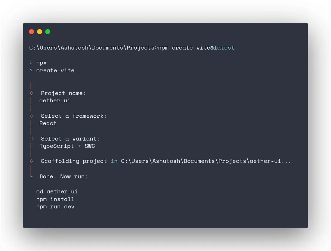
First, we need to set up a new project using Vite (6.3.5). Run the following command in your terminal:
npm create vite@latestFollow the on-screen prompts in the terminal and give your project name. For the purpose of this article we are using the name “aether-ui”. Since we will be using React and TypeScript, select the options accordingly.
After following all the instructions, you should be inside the aether-ui project directory and be able to see the Vite demo page at http://localhost:5173/.
Step 2: Installing Tailwind CSS
Next, we install Tailwind CSS (4.1.6) using the following command:
npm install tailwindcss @tailwindcss/viteStep 3: Configuring Tailwind CSS
After installing Tailwind, we need to configure some of our files to complete the setup.
First, we need to add the tailwind plugin to our vite configuration file so that it is detected correctly. For this, import and add the tailwindcss() plugin from the @tailwindcss/vite package that we installed, to your vite.config.ts file. Your file should now look something like this:
//vite.config.ts

import { defineConfig } from 'vite'
import react from '@vitejs/plugin-react-swc'
import tailwindcss from '@tailwindcss/vite'

// https://vite.dev/config/
export default defineConfig({
  plugins: [react()],
  plugins: [react(), tailwindcss()],
})
Remove everything from the global CSS file src/index.css and import tailwind CSS:
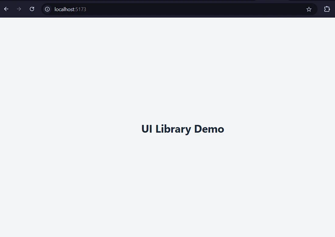
@import "tailwindcss";Replace everything in your App.tsx file with the following and run npm run dev:
export default function App() {
  return (
    <div className='min-h-screen bg-gray-100 flex flex-col items-center justify-center p-4 gap-6'>
      <h1 className='text-3xl font-bold text-gray-800'>UI Library Demo</h1>
    </div>
  )
}You should see the following in the browser at http://localhost:5173/ now:
At this point, we have a project with Vite and Tailwind installed.
Step 4: Integrating Storybook
Now we will be integrating Storybook 8 to develop our UI components in isolation and provide a clean documentation for each of those components. Install it using the following command:
npm create storybook@latest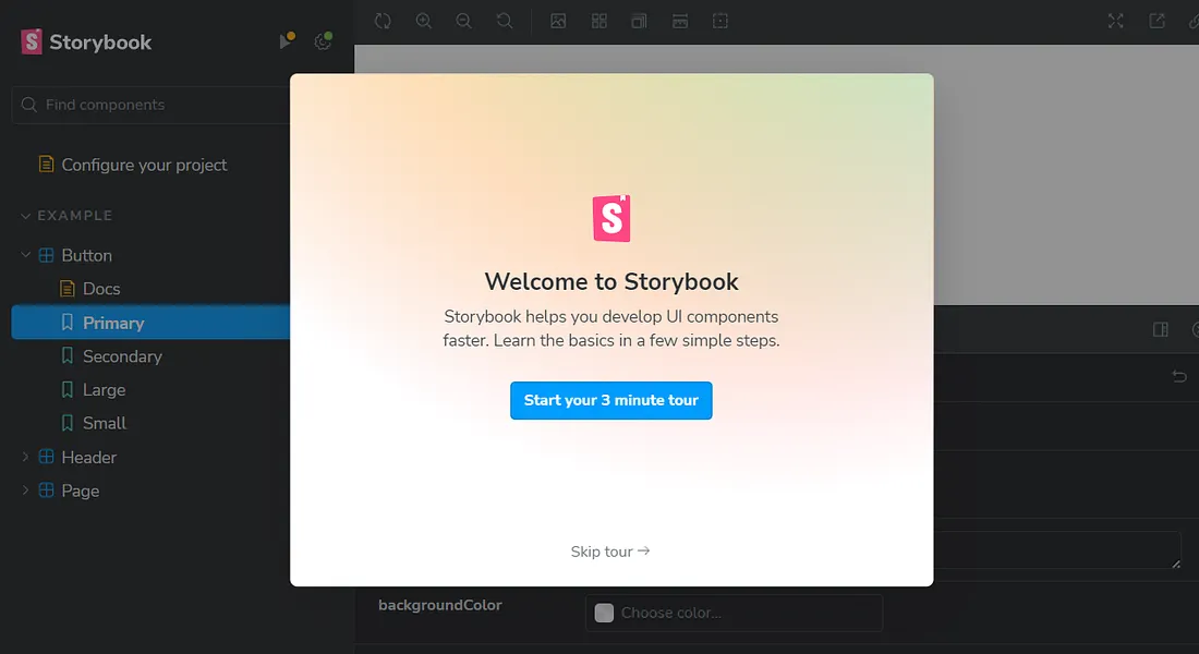
For Tailwind classes to work with Storybook, we need to import our global CSS in the .storybook/preview.ts file:
import '../src/index.css'I also removed some unwanted storybook related boilerplate code, which you can check in my repo (link at the end of the article) and compare accordingly.
Step 5: Installing Shadcn UI
Now we will be setting up Shadcn in our project, using which we will be creating our UI components.
Firstly, we need to add some code in compilerOptions of our tsconfig.json and tsconfig.app.jsonfile to resolve paths:
//tsconfig.json

{
  "files": [],
  "references": [
    {
      "path": "./tsconfig.app.json"
    },
    {
      "path": "./tsconfig.node.json"
    }
  ],
  "compilerOptions": {
    "baseUrl": ".",
    "paths": {
      "@/*": ["./src/*"]
    }
  }
}//tsconfig.app.json
{
"compilerOptions": {
// ...
"baseUrl": ".",
"paths": {
"@/*": [
"./src/*"
]
}
// ...
}
}Then we will install @types/node using the following command:
# (so you can import "path" without error)
npm install -D @types/nodeWe’ll add a line to the vite.config.ts file, so your app can resolve src paths with the alias @ without any errors, and now your file should look like this:
import { defineConfig } from 'vite'
import react from '@vitejs/plugin-react-swc'
import tailwindcss from '@tailwindcss/vite'
import path from 'path'

// https://vite.dev/config/
export default defineConfig({
  plugins: [react(), tailwindcss()],
  resolve: {
    alias: {
      '@': path.resolve(__dirname, './src'),
    },
  },
})Run the shadcn-ui init command to setup your project:
npx shadcn@latest initChoose the base color as per your wish, and the rest will be configured automatically:
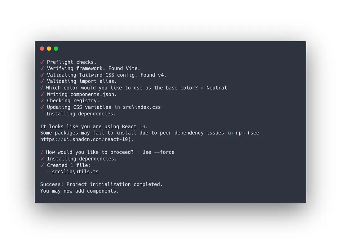
Please note that at the time of updating this article (May 14, 2025), shadcn does not fully support React 19 completely in the stable release, hence the warning in the screenshot above. React 19 support is added in the canary release.
Now we are ready to add our first component.
Step 6: Creating a Component
Now, let’s create a simple component using Shadcn UI. The command below will add the Button component to your project:
npx shadcn@latest add buttonYou can now import the Button component in your Storybook story or edit the component at src\components\ui\button.tsx
Step 7: Adding Component to Storybook
Finally, let’s add our Button component to Storybook. There will be an existing Button component created by Storybook, we can delete it along with other sample components. Edit file Button.stories.tsx in the src\stories\Button.stories.ts directory as follows:
import type { Meta, StoryObj } from '@storybook/react'

import { Button } from '../components/ui/button'

const meta: Meta<typeof Button> = {
  component: Button,
  title: 'Components/Button',
  parameters: {
    layout: 'centered',
  },
}
export default meta

type Story = StoryObj<typeof Button>

export const Default: Story = {
  args: {
    children: 'Click Me',
    variant: 'default',
  },
}

export const Outline: Story = {
  args: {
    children: 'Click Me',
    variant: 'outline',
  },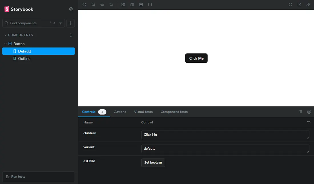
}Now, you can run npm run storybook to start Storybook, and see your component in action at http://localhost:6006/. It should look something like this, with two variants:\
You can now go ahead and customize your Button component and add more shadcn components from here.
Here is the link to the GitHub repository of above code which you can use for reference or template.
Conclusion
Congratulations! You’ve just set up a React UI component library using Shadcn UI, Vite, Tailwind CSS, and Storybook. This setup will help you create and manage your components efficiently.